
April 2026
For this project, creating an eight-page, saddle stitched booklet incorporating self written text based on the Design History Essay. Using a grid system layout and designing a design movement or designer.
Process:
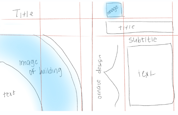
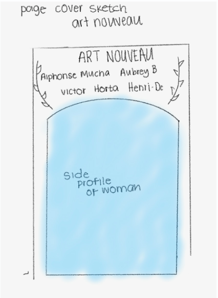
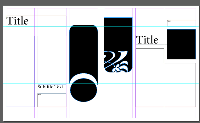
I struggled at first finding a grid system that I found that was interesting and still had that Art Nouveau style of movement. Having this basis of the sketching was helpful so I could make the basic shapes on InDesign and then figure out more detail orientated things after.
Page 1 Iterations:
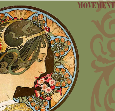
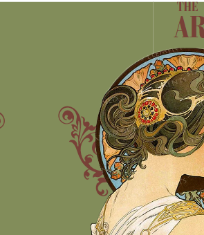
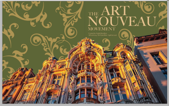
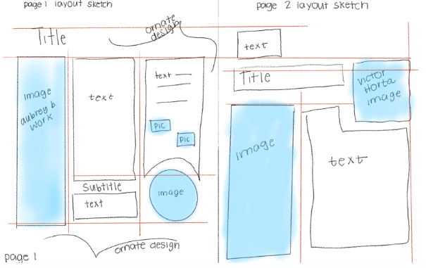
I struggled with this design because I wanted something that flowed over onto the back page to make it more visually interesting. I tried working around with different color combinations and different typography. I wanted something that was bold but wasn’t entirely sans serif due to the nature of the Art Nouveau movement. I also changed the background color to better tie to the other pages.
Page 2 Iterations:
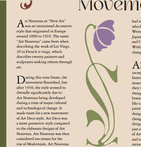
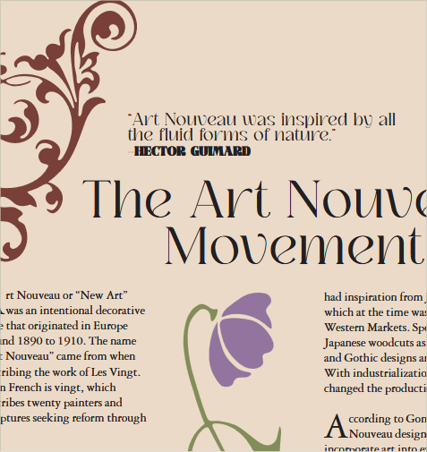
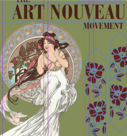
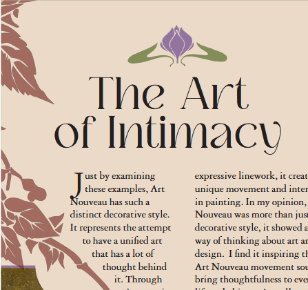
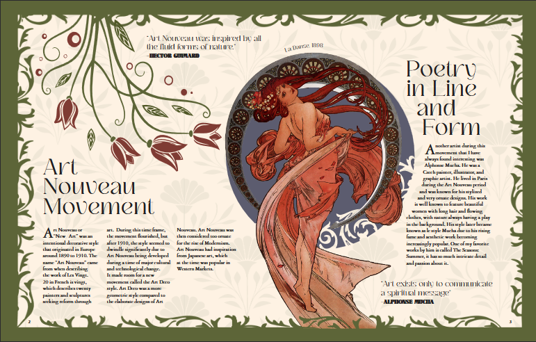
I knew from the beginning that i wanted more text and design interaction to create a unique Art Nouveau magazine. I incorporated ornate designs and flowers pieces at first. Then I started to progress and made bigger design elements with the text as the smaller piece to create a more intriguing design.
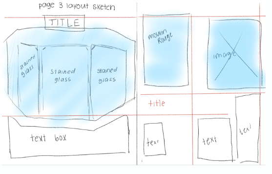
Page 3 Iterations:
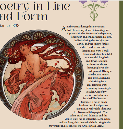
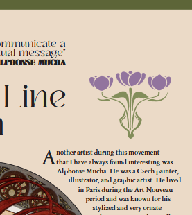
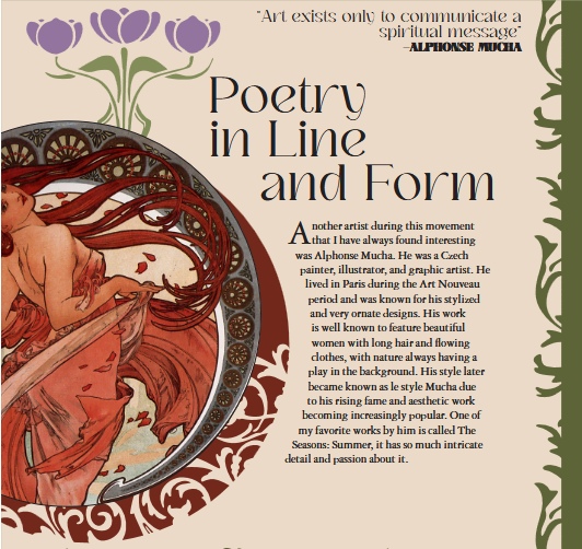
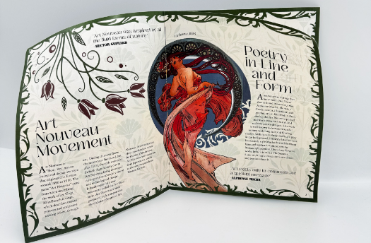
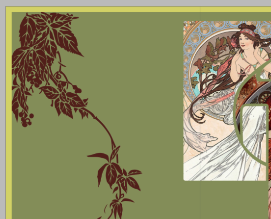
At first I only put the images in frames but I wanted something that felt more interactive with the piece. Like with the flowers, they felt to stagnant and out of place since they weren’t interacting and just floating on the page. To solve this I added more unique frames and created clipping masks for the images. I also made the caption more interactive with the image of the girl by making the text curved.
Page 4 Iterations:
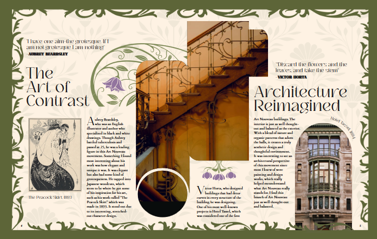
When I first put the shapes together on InDesign I had the middle shapes together. But once I put images inside of the separate shapes it looked unbalanced. So I merged the shapes together to create a unique photo frame. I got the shape inspiration from the frames that are often used in Art Nouveau. I then just flipped them different ways to create new shapes.
Page 5 Iterations:
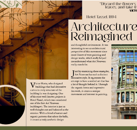

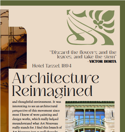
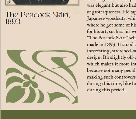
I also then made this frame for the image an arch which is a commonly used theme in Art Nouveau. And then curved the caption as well to balance that space out.I also added more spacing to the quotes so they didn’t feel so cramped. Also for most of these iterations I hadn’t yet added a pattern to the beige background. But when I did it made it overall visually cohesive to Art Nouveau.
Page 6 Iterations:
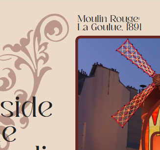
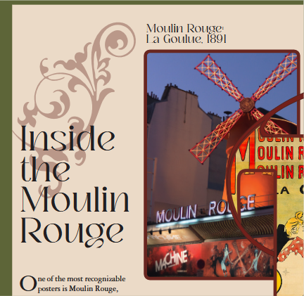
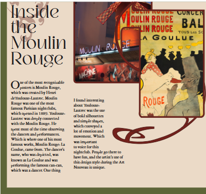
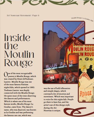
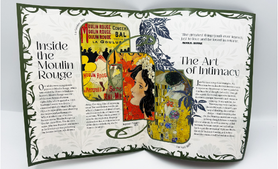
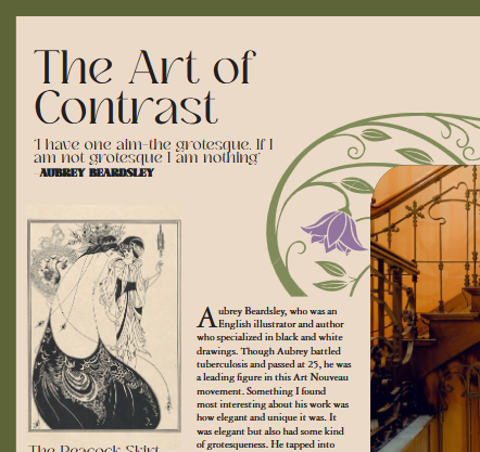
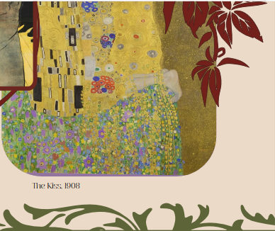
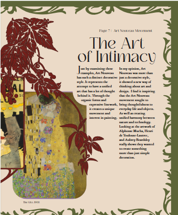
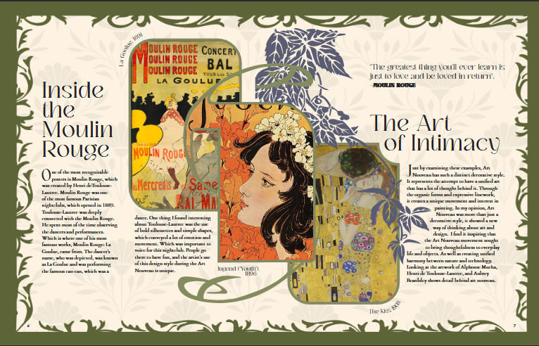
For this page I had the original frame with the line coming out of it red and had the building of Moulin Rouge but I swapped it with the original poster I had in the middle. I did this because it was distracting as the only building on the page. I then placed an orange and yellow illustration in the middle and kept the “The Kiss” illustration on the next page creating a more cohesive color palette.
Page 7 Iterations:
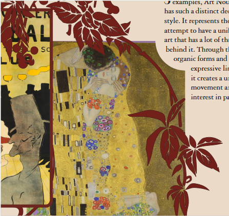
For this page I ended up using leaves as the unique flowers for this page. I later changed it to a blue color to be correlate with the yellow/orange color palette I had for this page spread. I had a flower header on the top of the title but it felt too isolated and stood out.
Moodboard:
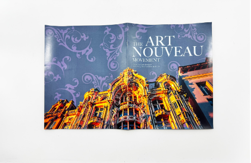
Final Design:
Final Mockup:
.png)