September 2025
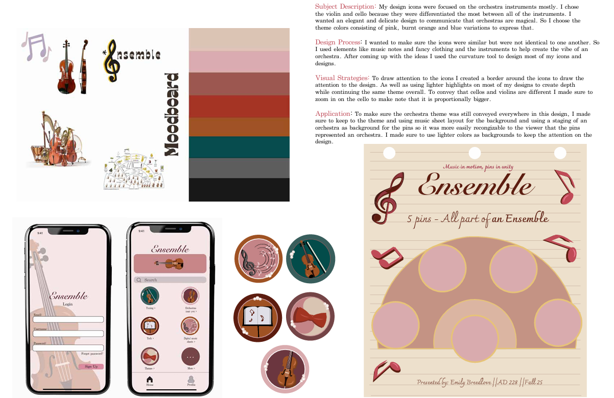
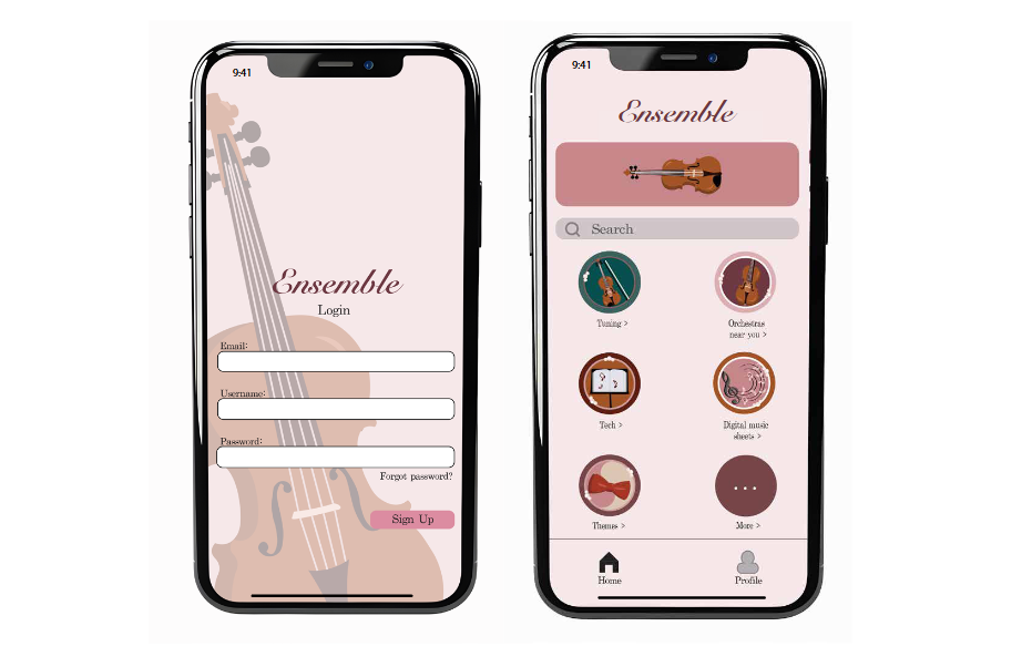
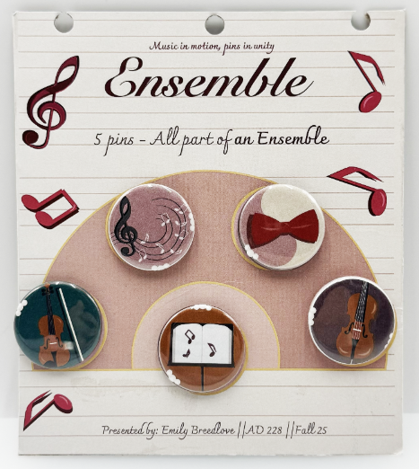
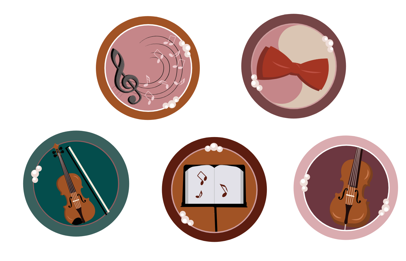
Symbols are effective for creating awareness of visual identity. Visual identity depends on perception and unlocks associations of an overall visual systems. For this project we designed a cohesive visual system using Adobe Illustrator that includes a set of 5 icons, a moodboard style guide, an app landing page mockup that integrates your icon designs into the user interface, and a final design board to showcase the project compnents with reflections. We then translated our designs into a set of button pins based on our icons and visual system, and design a display card to showcase them.
Process:
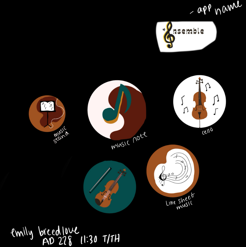
I loved being able to explore what all goes behind an orchestra prepping for an audience like the setup of all the instruments in their specific spots. Which influenced my pin board design. As well as the music sheets for the background of the board design. I think I was successful in creating a theme and being able to continue that through my app design, icon design and etc. I went for a more pink and elegant theme, with the pinks and pearls on the icons to communicate that an orchestra has an elegant theme.
Iterations:
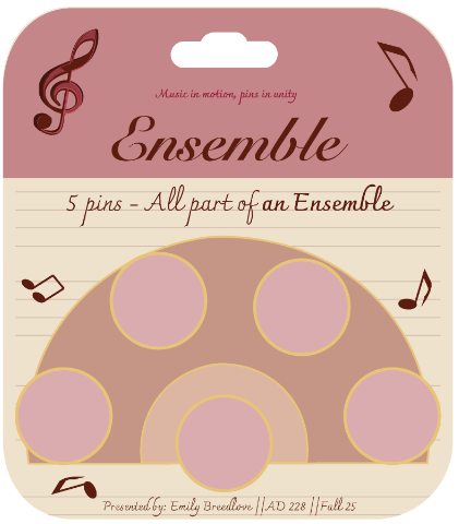
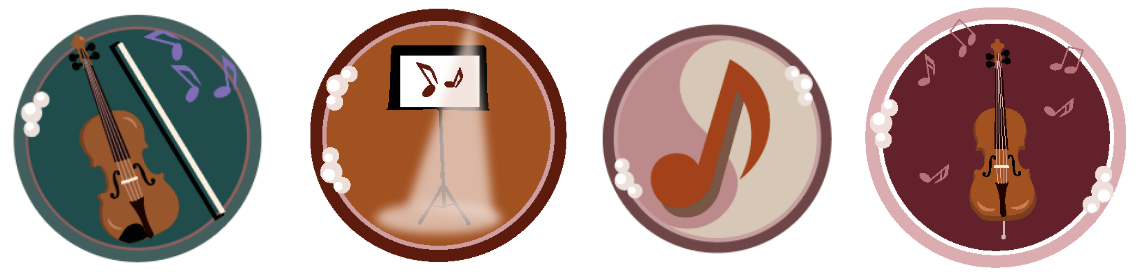
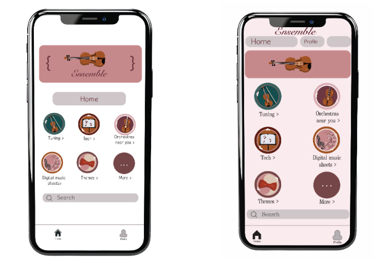
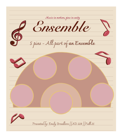
To make sure the orchestra was still conveyed everywhere in this design, I made sure to keep the color palette simple but effective. One thing I learned was changing the layout of the pin board to better fit the theme. I took away the top color border and extended the notebook background. Another process I went through was changing the icons due to them not fully conforming to the orchestra theme to the best extent. I also changed the app interface design to make it feel more clean and organized.
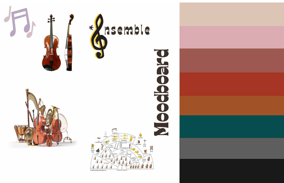
Moodboard:
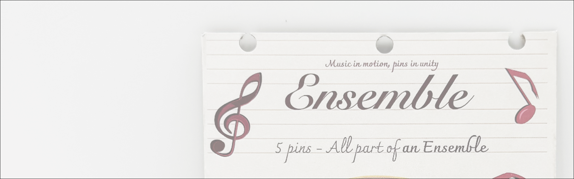
For the moodboard I knew I wanted something that had the instruments that make up a complete orchestra. For the color palette I also went for lighter colors as the highlights and the darker colors as backgrounds to help contrast the design and elevate it.
Final Design: